Streamlit is an open-source Python framework for building and sharing data applications. Its appeal is simple: developers can create interactive data or AI apps in Python with relatively little boilerplate, often making it one of the fastest paths from notebook idea to usable interface.
Why a dashboard is a great first app
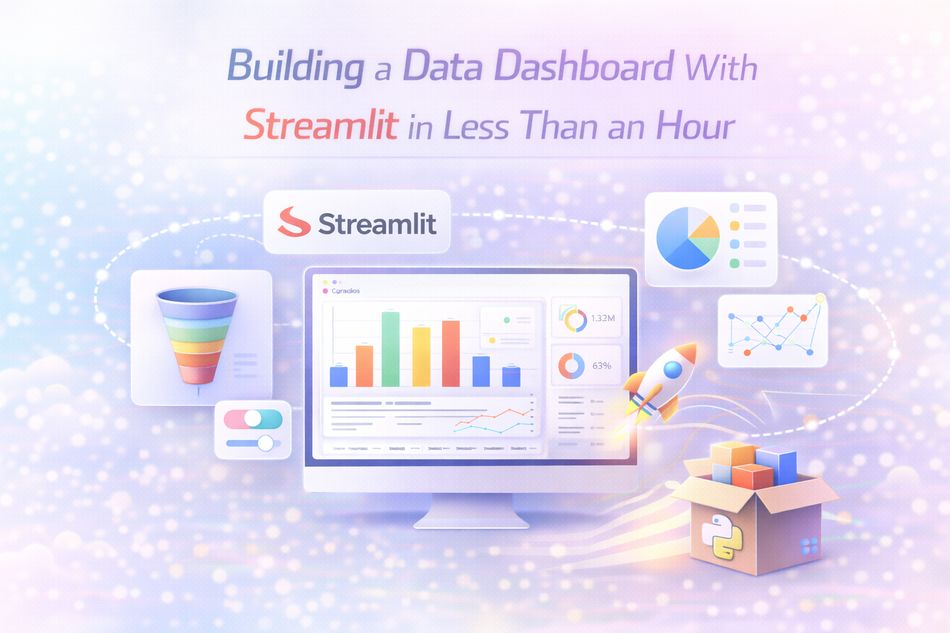
Dashboards teach the core strengths of Streamlit: input widgets, reactive reruns, chart rendering, file handling, and layout organization. A simple dashboard can move from CSV file to insight in surprisingly little time.
Typical flow
- Load a dataset
- Add sidebar filters
- Show KPIs and summary metrics
- Display charts and tables
- Offer download or export options
What makes a good dashboard
A good dashboard is not just interactive. It helps a user answer important questions quickly. That means choosing clear metrics, good defaults, useful filters, and visuals that support decisions instead of adding clutter.
Key Takeaways
- Start with the real user task, not the technology trend.
- Use structured workflows, examples, and evaluation criteria.
- Treat AI output as draft assistance unless verified.
- Choose tools and frameworks based on fit, not hype.
- Build habits of review, iteration, and grounded testing.
Further Reading
The most practical way to learn this topic is to move from theory into a small real project. Read the official documentation, test the ideas on a narrow use case, and review the results critically. That process will teach far more than passive consumption alone.